Posts

ART 210 PORTFOLIO- CARLEY

Image

Dream Life

Image
Animation- "Dream Life" For this project, we were told to create a 45 second animation with each Photoshop layer being 0.1 seconds long. That is a total of 450 frames. My animation is called "Dream Life" and it tells the story of me sleeping and having various dreams. In my dreams it is nice outside even when it isn't and then night time comes and everything is still and quiet except for the owl outside. Then I am in the ocean as a mermaid swimming with fish all around me. Next thing I know I am an astronaut in space until the sun comes and brings fireworks. All is calm until my alarm rings and I am up and ready for the day. I definitely had my struggles with this assignment. I struggled with being creative. I hit many walls and struggled with what was to come next. The hard part for my idea was that anything could come next, but that meant I had to think of something that would come next. I struggles a lot, but I am very pleased with the outcome. I learned a...

GIF Practice (Autoscopy)

Image
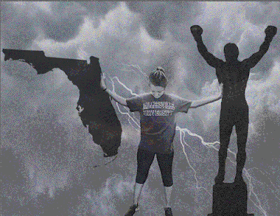
For this image, I made it restrictive as well as added some noise. I liked that it looked like an old television screen during a battle scene. The fuzziness adds a good amount of character to the image. For my second image, I made it black- white as well as added diffusion. I liked the overlay of the black and white on top of the already gray scaled image. The two mesh together and create a unique texture.  For my third image I changed it to no dither and perceptual. I also changed it to only have two colors. This created a very unique background that was almost came like. It made the storm in the background look very defined.  For my fourth image, I used restrictive along with no dither. I upped the colors back to auto. I love the colors that were added because it created a very unique color palette that is unlike any of the other images. For my fifth and final image, I wanted to do something completely different. I changed it to Mac OS with ...

The Hurricane

Image
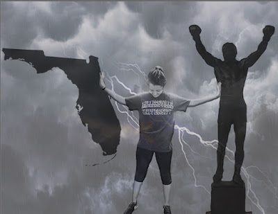
This project was very a very difficult one for me. I think I struggled with showing what I wanted to say, and how I wanted it to be represented. I decided to depict my struggle between living in Florida and living in Pennsylvania. I miss my friends and my family in Pennsylvania, but I know Florida is where I am supposed to be right now. I have so many negative associations with Pennsylvania and some of the things that I have been through. I also have so many positive memories associated with Pennsylvania and I am conflicted and fighting with where I want to be. Pennsylvania will always have a piece of my heart, but I am very grateful to be in Florida now.

Baby Hairs out for Cupcakes

Image
For this assignment, we had to take a picture of ourselves, turn it black and white, and then paint it back to color. I am very excited with how this turned out! The part I struggled with most was my skin tone. I ended up having to recolor my skin multiple times in order to find one that worked. I chose this picture because it describes my personality. Baby hairs flying a pink cupcake and a smile. Overall I think this is one of my most successful photoshop projects yet!

"I'll be there for you!"

Image
F.R.I.E.N.D.S. Easily one of my favorite shows I have ever watched. I think everyone wants a life like the people in this show where your best friends all live close to each other and you get to live your lives together. The good, the bad, and the ugly all together supporting one another. My first attempt of this project took me to the Hollywood sign in California. It was a terrible attempt and nobody should ever see it. In a way I am thankful that I did that because it gave me an opportunity to create this and I like it a lot more. I ran into most of my problems when I was trying to get my skin tone to match the ones of the characters. Although it is not perfect, I am pretty proud of how it came out.

Binary Name

"Carley" 01000011 01100001 01110010 01101100 01100101 01111001 00100000 "Bernstein" 01000010 01100101 01110010 01101110 01110011 01110100 01100101 01101001 01101110

Inner Self

Image
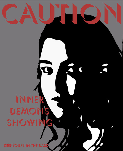
For this project, we had to create a poster inspired by the works of Banksy using a photo of ourselves. I chose to use a picture from my senior portraits that had a very unique contrast to it. I accidentally forgot to lock my bottom layer, and the copy of the picture on top got moved to the left a little. This was a happy accident. When I used image trace, it looked almost as if I was watching myself. Very creepy, but I'm in love with what happened. It reminded me of having to hide parts of yourself for fear of what could happen. You have to hide your inner demons from the world, but what happens when they come out? This is the original photo shot by Corrine at Silverbox Studios in Pennsylvania.

Volkswagen Mesh Mug

Image
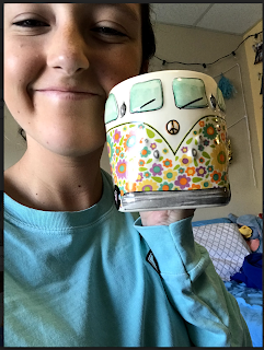
At home, I own a Volkswagen Beetle that I love very much. When I was shopping one day, I saw this mug and it reminded me of my little car. The bright colors and hippie like patterns makes the mug special. When we were assigned this project, this mug was the first thing that came to my head. I wanted to see if I would be able to create one of my favorite objects on the computer. I am very pleased with the results. It took me about three hours because I had to hand trace every single flower and leaf on the mug. I am very pleased with the results.

Taking Care of Business (Business Cards)

Image
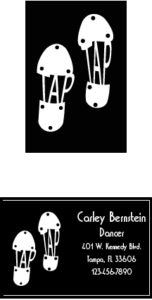
For this business card I decided to do something classy. I dance and have danced for the last ten years of my life. It has made me who I am. I am so grateful for what it has given me. There is no place on the world that I feel more myself then a stage dancing. Tap is more than just dance, its music. You have the power to create sounds with your feet and every step is different. Every little move you make creates a different sound which is unlike no other. This business cards is one of my favorite I have created. The story that is being told through the moving company is about my family's recent move to Florida. In July of 2017 we moved from Pennsylvania to Cape Coral, Florida. This was a new beginning for us. I thought that I would use a stork bringing Florida to people because storks bring new things and new beginnings. Compassion is something that is very important to me. You may not know how to help someone, but if you show compassion you are a better person. I chose...

Logo Ideas

Image
These are my logo ideas for the upcoming project. I chose to do these five words because they not only describe me and my personality, but they all have a special place in my heart. The symbols themselves reflect what that word means to me. They may just be words, words can create thousands of images for everyone and that is something that is unique to you and your brain. I hope you enjoy these fifty logos that are a little peak into my life and my brain.

The Wordiest Place on Earth

Image
This project was one of the more difficult ones that I have done so far. I feel like I say that every time but that is because they keep getting more and more difficult for me. I spent many hours in the lab with this one. I couldn't get the text to look the way I wanted it to. I think it turned out pretty good. I like the texture that the words created. The different colors represent the different princesses that have the lyrics to the song corresponding. For example the furthest one to the left is lyrics to "Part of your World" from little mermaid so the color for that is a light teal. I had to move the Walt and Mickey statue because of the overlapping looking crowded. I like it over to the right because it looks like the spirits of Walt and Mickey are still at the castle every night looking at the fireworks.

Calligram Examples

Image
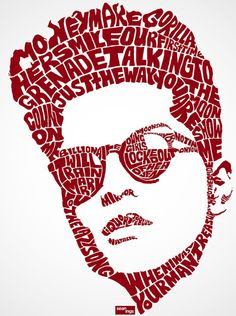
This calligram is of Bruno Mars, one of my favorite artists of all time. The details in it are fascinating and the color really works with this image. I love the sunglasses and how it looks like their is a reflection on them with the open space on the right lens. His lyrics surround his head as if he had just thought of them and they are flowing out of his brain. This calligram is very unique and different. I love the different perspective that it took. Instead of using the whole fish like most artists would do, they decided to use the head. I especially love the bubbles and how they came out. It offered something different that most calligrams with a fish don't have. I love this calligram almost as much as I love Buzz Lightyear.  Anything Disney immediately draws my attention, and this one did not disappoint. No matter how far you are away from this piece, you can still tell that it is Buzz Lightyear which is a really cool aspect. I have seen other work from this art...

Sun-Daze

Image
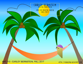
This is my final canvas project entitled "Sun-daze". I am very happy with how the final project came out. I have had this idea for a while, but I wasn't sure how I would even know the tools to create it. This one actually took me less time than my pineapple. It took me maybe about 6-7 hours overall. I bought some graph paper, and it made it so much easier for me.  Throughout the project, I learned a lot about gradients. Each little aspect of this project has a gradient. It was something I was struggling with before, so I wanted to make sure that I included in my final project. I love the palm trees the most because of all the different shades of green in them. If I were to change anything, I would definitely change the birds. They look like they were thrown in last minute and I know that I could have done better. I would also change the sun and make a gradient around it. I wasn't sure how to do it, but I would rather have had a sun that had undefined lines instead o...
Pineapple Princess

Image
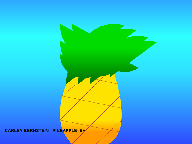
This project was one the hardest we have had to do so far for me. I spent many hours in the lab working on it. I am very proud of the final project. Pineapples are one of my favorite fruits because of  the vibe that they give off. They make me feel tropical and happy even on the cloudiest of days. This os my first pineapple project, but it will not be my last.

Shaping Up

Image
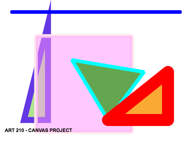
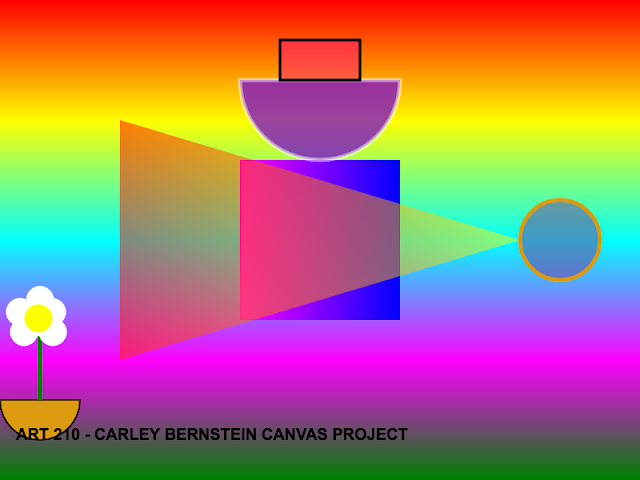
This was one of the first projects that we ever worked on. I had a lot of fun experimenting with the different shapes. The line widths as well were fun to try out different ones. I especially like the transparency of the square because it is like a window looking on the shapes behind. From an abstract point of view, the big triangle is the mother looking through the window at her two kids playing outside.

Gradient Project

Image
I loved the idea, of stacking shapes on top of each other with contrasting colors. The background is bright colors and invites you in to look all around. The triangle overtop of the square creates a different color that stands out. The flowers is may favorite part. It was probably the part that came the most natural to me, and I love how it turned out.